The easier your website is to use, the more people use it. An essential part of “easy to use” is intuitive. Intuitive design means that when a user sees it, they know exactly what to do.
The main thing about intuitive design is that it’s invisible. Design is intuitive when users can focus on a task at hand without stopping even for a second. Intuitive designs direct people’s attention to tasks that are important. In the end, an intuitive design focuses on experience.
Imagine that you’re at a car rental place and you’re pointed out the car you’re getting. You walk up to it, and want to get in. You arrive to the car, reach out your hand to open the driver’s door – but there’s no handle! How do you get in?
This is an example of non-intuitive design. A non-intuitive design steals the focus from the user. He was trying to get in the car, but the process was interrupted by an unfamiliar situation with no obvious solution.
The same goes for web design. As long as the users can complete the tasks they want without interruption and thought, it’s all good. Intuitive design is invisible and non-intuitive design is a disruptor. Since intuitive design is invisible, people will not actually appreciate it (since they won’t even notice it) – but they will immediately take notice if it is not there. Unintuitive design forces people to focus on elements not related to their tasks.
The problem with designing intuitive interfaces: intuitive for who?
Why are there so many websites that make people cringe? Why not make all websites intuitive? That’s what everybody wants, right? The thing is that building intuitive websites is hard – people are different. What’s intuitive to one person is not intuitive to another. The design itself cannot be intuitive – it’s whether the person using it feels it’s intuitive or not.
I believe most websites are designed with good intentions. They’re meant to be intuitive – but usually for the designer! The average developer or designer doesn’t spend any time ever watching people use the things they are designing.
People see the world as they are, and when they design something, they unconsciously design it for themselves – for people that have the same level of computer skills, experience using this type of interfaces and what not.
Getting intuitive design right starts with understanding your users. You need to figure out what’s intuitive for them.
An important concept to understand here is current knowledge vs target knowledge.
Current knowledge vs Target knowledge
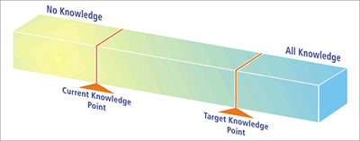
People come to your website pre-loaded with existing knowledge (from previous experiences and so on). This is what Jared Pool calls ‘Current knowledge’. Then there’s ‘Target knowledge’ – it’s how much the user needs to know in order to use your website or application.
The difference between the two is called ‘knowledge gap’. Your job is to build an interface that minimizes the knowledge gap between what the users know prior to coming to your site and what they have know in order to use it properly.
What makes this difficult is that you might have all sorts of users. Some are tech savvy computer nerds and some are computer illiterate grannys plus everything in between.
The narrower your target group is, the better for you. The wider your audience, the bigger the design challenge.
Conceptual models
If users have never used your site, it doesn’t mean that their Current Knowledge about it is zero. They have probably used other, similar websites or product before. Some haven’t, but everybody has a conceptual model about it.
Let’s say you’ve never shopped online – but you have done it offline millions of times. So I sit you down in front of a computer and show you Amazon.com, telling you that you can buy stuff here.
People will now use the conceptual model of offline shopping and will aim to replicate the same experience. Their expectation of what online shopping is like is derived from the mental model of offline shopping – the closest experience they’ve got.
But let’s say they’ve bought stuff online before, just not from Amazon. Now their conceptual model will be different, as their expectation to shopping on Amazon.
If the majority of your users have never used the kind of website or online service that you have, you need to deal with the conceptual model. This is why you have to figure out their closest experience to using your site. If the website doesn’t match the user’s mental model, the user will find the website hard to use, unintuitive.
Know thy user (study them!)
In order to design websites that our users find intuitive, you need to learn where the current and target knowledge points are. What do users already know and what do they need to know?
There are 2 great ways of finding this out:
- Field studies. You go to your customers and observe them using the web in their natural habitat. You’ll get an idea of their Current knowledge.
- Over the shoulder usability tests. Get people to use the site, have them perform a set of tasks and ask them to comment their thought process out loud. This can also be done remotely (over the internet). This will identify the Target Knowledge.
In both cases you observe and take notes without interfering. You will quickly identify the main issues. 10 test subjects will normally already reveal over 90% of the challenges.
From here, proceed to build personas based on what you learned.
When is a website intuitive to use?
Broadly speaking, that design is intuitive when current knowledge equals target knowledge.
Jared wrote that in their research they discovered there are two conditions where users will tell you an interface seems ‘intuitive’ to them:
- The current knowledge point and the target knowledge point are identical. When the user walks up to the design, they know everything they need to operate it and complete their objective.
- The current knowledge point and the target knowledge point are separate, but the user is completely unaware the design is helping them bridge the gap. The user is being trained, but in a way that seems natural.
In other words, you either make it so easy that it doesn’t require any learning, or add instructions, tips and microcopy that is easy to spot and follow.
The best example for the 1st condition is Google search. You can not use it wrong. There’s no learning curve. It’s as obvious as it gets.
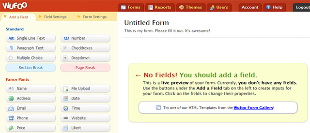
A good example for the 2nd condition would be Wufoo. When you log in and start building your first form, the instructions make it easy and the learning process seems natural.
So you have two options for an intuitive design. You can either reduce the target knowledge requirement until it meets current knowledge by simplifying the design. Or move current knowledge to target knowledge through instruction. Or a bit of both.
Intuitive navigation (and search)
76% of consumers say the most important factor in a website’s design is “the website makes it easy for me to find what I want.”
So how do they go about finding the stuff they want? Navigation of course. Here’s where it gets tricky: if your site has a ton of content, how do you structure it so it would make sense?
A great method for figuring out which content goes under which menu item is card sorting. Card sorting is a great, reliable, inexpensive method for finding patterns in how users would expect to find content or functionality. It will also help you with choosing the wording for menu items.
It’s important to call your menu items by the right names so people would know what’s behind the link. Use trigger words.
The interesting thing is that 50% of all users don’t buy because they can’t find what they’re looking for. This is why search is super important. You need to have search on your site, and it has to be easily found. Amazon has a huge inventory and they’ve made search the centerpiece of their site. Can you imagine it any other way?
Oh, and make sure you turn ‘Site Search’ tracking ON in Google Analytics. You will also find that users that use search will usually have a higher conversion rate (searchers have intent, they know what they’re looking for).
People spend most of their time on otherwebsites
A good thing to bear in mind at all times is that people spent most of their time online on OTHER websites. So they’re used to websites being a certain way (Current Knowledge). If you mess with convention, you’re asking for trouble.
Typical convention items:
- A click on the logo (in the top left corner) should always take back to the home page,
- The last link in a horizontal navigation menu should be ‘Contact’ (or the bottom one in a vertical menu),
- You should have contact information in the footer,
- Strive for consistency: navigation and other important elements will remain in the same location throughout the website,
- Links should be easily distinguishable from regular text,
- If users can and should scroll down, the scrollbar has to be visible,
- Left-aligned text is easier to read than right-aligned (since westerners read from the left),
- Display descriptive help messages and notifications,
- Use plain language terms throughout the interface that users can understand (e.g. use ‘Contact’ instead of ‘Communication’).
Yes, there are always exceptions to the rule – but innovation is difficult and risky. In most cases, don’t re-invent the convention. Have the stuff work like people expect it to work.
Be careful about redesigns
Luke Wroblewski took notes at a recent An Event Apart conference in Chicago where Jared Spool made this point about redesigning websites: they can mess with the knowledge gap.
20% of the users spend 80% of the revenue on a site, and it’s those top buyers that are most effected by redesigns. They know how things work, and when you redesign the website, you change it up on them.
It’s not that people hate change. They just hate change that takes away their current knowledge. An intuitive design happens when we don’t force our users to attend to change.
A major retailer launched a $100M redesign and saw conversion drop 20%. A law firm had to shut down. Doctor’s offices and airlines experience significant delays. Their site/application was no longer intuitive for their most important users.
You need to focus on your most important users buyers. The design needs to be most intuitive for them. Don’t try to please everybody.
A good way to go about redesigns is by using the Lean Design methodology – reduce the time it takes to go through the build-measure-learn cycle. Little changes to a site over time are often a better approach than major redesigns. This enables you to measure and thus learn quickly whether a change brings positive or negative results. “We’ll be successful if the day we go live, no one notices.”
This applies when you’ve got a large repeat audience. If your site has little traffic and the current design is flawed, don’t hesitate to do a complete overhaul.
Conclusion
Aim to make your website intuitive for your core users, and you will be rewarded with higher conversions and user loyalty. Study your users’ behavior, and always perform user testing on your interfaces.


